Color Psychology in Furniture Selection: Crafting Emotionally Resonant Interiors
Using color strategically to influence mood, spatial perception, and occupant behavior in luxury homes.
Color selection in high-end furniture is far more than an aesthetic preference; it is a sophisticated psychological and spatial tool that directly shapes perception, mood, behavior, and long-term emotional comfort. For many homeowners—especially those with limited renovation or design experience—color is often approached intuitively or trend-driven. However, in luxury residential interiors, color decisions demand strategic thinking, material intelligence, and an understanding of human response over time. My extensive consulting experience consistently shows that the most successful interiors rely on restrained, intentional chromatic systems rather than bold or fashionable statements. At a foundational level, color influences how a space is perceived in scale and temperature. Warm tones such as terracotta, camel, soft rust, and muted ochre visually advance, creating intimacy and emotional warmth.
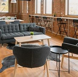
These hues are particularly effective in social spaces like living rooms, dining areas, and libraries, where connection and conversation are prioritized. Cool tones—sage green, slate blue, soft gray, and desaturated teal—recede visually, supporting calm, focus, and restoration. They are especially appropriate for bedrooms, studies, and wellness-oriented spaces. For new homeowners, understanding this basic spatial psychology prevents common mistakes, such as using overly cool palettes in already shadowed rooms or excessive warm tones in compact spaces. Beyond temperature, saturation and value are critical. High-saturation colors demand attention and can quickly lead to visual fatigue, especially when applied to large furniture pieces.
In luxury interiors, color authority often lies in restraint: low to mid-saturation hues layered across multiple elements create richness without aggression. A muted olive sofa, for example, paired with warm neutral wood and softly textured textiles, offers longevity and adaptability. Over time, such palettes accommodate changes in art, lighting, and accessories without losing coherence. Material and finish dramatically alter color perception. The same hue expressed through velvet, leather, lacquer, or wood veneer will register differently under identical lighting. Matte finishes absorb light, softening color intensity and conveying calm sophistication.
Glossy or polished finishes reflect light, increasing vibrancy and visual sharpness. Metallic undertones—brushed brass, bronze, or steel—introduce subtle chromatic complexity that shifts throughout the day. In high-end furniture design, these interactions are carefully orchestrated so color feels alive rather than static. For inexperienced clients, this underscores the importance of viewing samples in situ rather than relying on digital renderings alone. Color layering is another defining principle of luxury interiors. Rather than relying on a single dominant hue, refined spaces employ a hierarchy of related tones across furniture, textiles, rugs, and millwork.
This creates depth and visual rhythm while maintaining cohesion. For example, a neutral base of warm gray upholstery might be supported by slightly darker wood tones, softened with lighter textiles and punctuated by subtle accent colors. Such layering allows the interior to feel rich yet composed, avoiding the flatness often seen in monochromatic or overly contrasting schemes. Psychological engagement with color extends beyond aesthetics into daily behavior and wellbeing. Research and lived experience both confirm that color affects circadian rhythm, stress response, and social interaction. Cooler, desaturated tones promote rest and mental clarity, making them suitable for private zones.
Warmer, balanced palettes encourage engagement and appetite, supporting shared activities. In luxury homes, this knowledge is applied intentionally: furniture colors guide how spaces are used, subtly influencing mood without overt signaling. This level of consideration communicates design authority and builds trust with clients. Personalization is essential, particularly for first-time renovators who may feel uncertain about expressing taste. Color should reflect not only spatial logic but also individual temperament, cultural background, and lifestyle. Some clients respond positively to warmer, enveloping palettes, while others prefer cooler, minimalist environments.
Through guided discussion and sample testing, designers can help clients articulate preferences they may not yet consciously understand. This collaborative process reinforces confidence and ensures emotional resonance rather than regret. Longevity is a key criterion in luxury color selection. Trend-driven colors—highly saturated greens, bold jewel tones, or fashionable pastels—often feel dated within a few years. In contrast, colors rooted in nature and material authenticity tend to age gracefully. Earth tones, mineral hues, and softened neutrals adapt well to changing tastes and evolving interiors.
For homeowners investing significantly in furniture, this approach protects both emotional satisfaction and financial value. Lighting must always be considered alongside color. Natural and artificial light alter hue perception dramatically. North-facing rooms cool colors further, while warm artificial lighting can distort certain pigments. In my practice, furniture colors are evaluated under multiple lighting scenarios—daylight, evening ambient light, and accent illumination—to ensure consistency and comfort. This attention to detail prevents disappointment and reinforces professional credibility. Color also establishes visual hierarchy.
Larger furniture pieces typically anchor the palette with quieter tones, allowing smaller elements—chairs, cushions, or side tables—to introduce controlled variation. This hierarchy maintains clarity and prevents visual chaos. New homeowners often make the mistake of assigning strong colors to dominant pieces, limiting future flexibility. Education around hierarchy empowers better long-term decisions. From an experiential standpoint, well-chosen color palettes foster emotional security. Homes feel predictable yet engaging, calming yet expressive.
This emotional stability is a hallmark of true luxury. When residents feel at ease within their environment, the design has succeeded beyond visual appeal. Ultimately, color psychology in high-end furniture transcends decoration. It is a strategic instrument that integrates material intelligence, human response, spatial logic, and long-term adaptability. Designers who master chromatic nuance demonstrate expertise, authority, and trustworthiness, guiding clients toward interiors that support wellbeing, expression, and enduring satisfaction. For homeowners—especially those new to renovation—understanding the deeper role of color transforms decision-making from uncertainty into confidence, ensuring that luxury is not only seen, but deeply felt over time.


Jane Doe
ReplyThis article completely changed how I think about color in my home! I used to choose furniture based on style alone, but now I understand how color affects mood and behavior. I painted my living room walls a soft blue and added a navy sofa, and the difference is incredible - the space feels calm and inviting. The section on color temperature was particularly valuable - I now know that warm colors create a cozy atmosphere while cool colors promote relaxation. I also appreciated the tip about using accent colors to add energy to a space - I added a few orange throw pillows to my blue sofa, and it adds just the right amount of warmth.